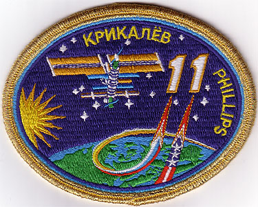
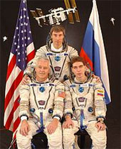
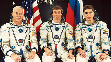
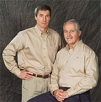
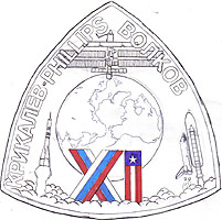
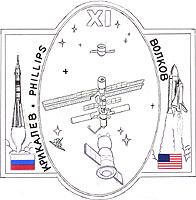
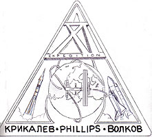
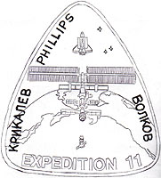
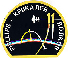
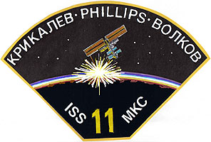
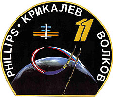
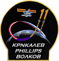
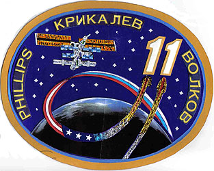
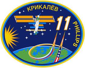
The Expedition 11 crewpatch was designed by Tim Gagnon from Titusville, Florida, here you can read in his words the story of the Expedition 11 patch...
"...In April 2004 I wrote to John Phillips to congratulate him on his assignment as a member of the crew of Expedition 11 to the International Space Station and to ask if I might help design the patch. He responded enthusiastically that he had a design in mind but would appreciate the help. He wanted me to know up front that Sergei Krikalev was the Commander and he might already have some thoughts on a patch design – so my efforts could be in vain. I appreciated the honesty and let John know that I was willing to accept the challenge and was confident that some elements I created would make the final patch. John also let me know up front that both he and Krikalev prefer simple designs without many symbolic design elements.
I will occasionally use John’s email messages. When I do they are in bold type. Note he refers to his commander by his last name so there wouldn’t be any confusion about which “Sergei” he was speaking to:
April 21, 2004:
The current plan is that Krikalev and I will launch in April 2005 on a Soyuz, with Volkov following a month or so later on STS-121. Another possibility is that all three of us will go up together, either on a Soyuz or a shuttle.
…The most unique thing about our mission is that we're getting there on 2 different vehicles. I made a crude sketch of a design based on this aspect. It's a rounded isosceles triangle, pointing up, with a Soyuz rocket and the names Krikalev and Phillips along the left leg of the triangle. On the right leg of the triangle, it has Volkov's name and then the mated shuttle stack. At the top of the triangle is the space station. In the middle is a north-polar view of earth, showing our launch sites in Kazakhstan and Florida, adjacent to the Soyuz and shuttle, respectively. That's my whole idea, with no additional design elements.


Above: draft A and B
I created four sketches, one based on John’s description (draft A) and a few illustrating the uniqueness of this expedition (drafts B, C, & D). I sent them via email to John in May. John responded that he was impressed with my style and would soon show them to Krikalev. (They did a lot of separate training last spring and summer). Then he would write with Krikalev’s comments. One immediate point was that they agreed this patch would not use Roman numerals but the Arabic “11”.


Above: draft C and D
After reviewing the four drafts John sent me an email to let me know that they decided to change the design from one based on a description of the mission plan to one that would be more flexible to possible changes. Both he and Krikalev felt that, due to uncertainties in the launch vehicle and selection for the 3rd crewmember, a design incorporating both Soyuz and Shuttle might be “risky”.
That is, the patch might require a complete redesign if all three crewmembers ended up launching on the same vehicle. He mentioned a design that he and Krikalev had sketched out:
The basic shape is the upper 2/3 of a circle, flat on the bottom (or perhaps slightly concave downward at the bottom). In the bottom of the design is a part of the earth. Lifting off from the earth, we have the path of a rocket, marked by a white smoke trail, perhaps with an orange flame nearest the top. The path looks roughly like a lower-case "alpha" from the Greek alphabet. (Draft C incorporated the capital letter “alpha” in the design.) The right, upper tail of the alpha continues upward to a star (or ISS) near the top of the circle.
There is a second rocket plume that comes straight up from behind the earth, parallel to the main one, so they form the number eleven. This way we can say it refers to two rockets, or just to the number 11.


Above: draft E and F
On July 18th I sent a sketch incorporating the latest suggestions, (Draft E) and one that I had been playing with when I received his last email, (Draft F). John wrote back to let me know that he received them but that he was taking a couple of weeks off to vacation with his family so it would be awhile before our next communication.
August 10, 2004:
Hi Tim - Had a meeting this morning with Krikalev and Volkov about the patch. There's still no breakthrough on who's launching on what vehicle, so we’re pressing on as if Krikalev and I will launch on Soyuz, followed by Volkov on shuttle. (Draft F didn’t survive. It unfortunately (due to the angle of the ISS and the orbital sunrise) reminded them of a bomber pulling up after destroying a city – oops)
1. We like the basic shape - circle flattened at the bottom. We'd also like to see a variant in which the names are put on an extension at the bottom, sort of like a keyhole-shape, but with the rectangular part quite short.
2. We all agreed that the curvature of the earth should be increased (in other words, decrease the radius of the earth), such that the edge of the earth no longer cuts across our names.
3. It's time to add some color to the background. How about very dark blue for the sky and a lighter blue, or blue and white, for the earth?
John then suggested a change in “alpha” shape:
First, let's keep the whole “alpha” on the front side of the Earth.
Second, Instead of a "launch point" shown on the front of the earth, the trajectory should appear to start behind the earth at right.
Third, we'd like it if the smoke plume that forms the alpha would start fat, and get narrower and brighter as it moves toward the "eleven".
I was impressed that the changes suggested after each time the crew met seemed to make sense and did improve the design. I called John, asking about incorporating the national flags of the crew into the launch plumes and about possible star constellations that might be meaningful. His email came the next day:
August 12, 2004:
Hi Tim - We had a crew discussion about the patch design yesterday, after you and I talked. We are thinking about possibilities of stars in the background, but haven't decided anything yet. … Let's stay with the current station image, but perhaps make it bigger or move it a bit to the left so there's not such a big blank space on the left.
Concerning flags or colors in the plumes - I think this idea has a lot of potential. Krikalev's initial response was to actually start each plume with a flag (Russian on the left plume, American on the right). I think this is a good idea, but it might be difficult to implement due to the way the plumes cross. For examples, you could have each plume start with a flag (which is partly hidden by the earth), then the flag gives way to a white or silver plume, which gradually narrows and turns gold or red just below the "eleven" digits. I think this is worth a try. Let your artistic instincts be your guide!


Above: draft E2 and E-alt
On August 19th I sent both designs in color gratified that my suggestions were being incorporated and that the design was evolving into something they would be proud of. (Draft E2 and E-alt.). We were getting close. John responded:
August 24, 2004:
Tim - I've got the images, and they look great! I'll talk about them with the two Sergei’s this afternoon.
Anyway - thanks for the quick service - we'll have more inputs in a day or two. John.
And a week later…
September 1, 2004:
Hi Tim – Had a meeting with the 2 Sergei’s about the design. They like the artwork you sent last time (cutoff circle and "lightbulb" shape), but aren't crazy about the shape. (Sometimes a client needs to see their suggestion and it doesn’t work like they imagined)
I drew a shape tonight that will be more to their liking - it's between an ellipse and rectangle. As you will see, I took your design and wrapped it in a different shape. Here is a fairly long list of specific comments/suggestions:
1. We all agreed that it was too dark. So we would like to go a couple of shades lighter, sort of a royal blue, for the sky.
2. We agreed that the plume should be fatter, to further suppress the dark areas. I put 3 stars in the American flag. We think the plume should probably go straight from the American flag to either gold or orange, then spice it up with a red insert just below the numbers. This might take a bit of experimentation.
3. I like your perspective view of the station (the cosmonauts liked the straight-on schematic view better, but I think I prevailed here). I checked it using our virtual reality software here, and the rendering of that view is in fact nearly perfect. But let's go with less detail - We would rather be overly bold than overly detailed.
4. Let's try a gold border (instead of yellow), and have the names in the same color.
Thanks a lot, John.

Left: Final draft
In late September I sent John my final draft of the design with color explanations for the graphics folks at JSC. My part in this project was finished (save for some minor consulting). John responded the next day:
September 22, 2004:
Hi Tim - Thanks very much for the new design - it looks great to me. My next chance to show it to Krikalev will be on Monday. You do great work - I know this was a big effort for you, and I certainly appreciate it. I'll keep you informed about our progress with the graphics folks and the approval process, John.
In October and November the patch artwork I sent was “tweaked” by John and Krikalev. You’ll notice that my launch plumes had both flags on one plume. I did this because Sergei and John would be launching together. I work in an elementary school and used glitter for the plume. I was thinking that this could be embroidered the same was the plume was on the Apollo 12 patch. The final design (which has one flag for each plume) actually makes more sense illustrating the cooperation between Russia and the United States. The plume also resembles John’s description from his September 1st email.
Then the design came under the care of Terry Johnson at JSC, who also designed a two-person version in which “Volkov” was replaced by a sun image, digitized it and “Phillips” was moved to the right side. Terry’s work was essential because he was able to take my artwork and make it possible for reproduction in printing as well as embroidery. Something I wasn’t able to do. Thank you Terry.
December 11, 2004:
Hi Tim - I've been real busy here (in Russia, again). We made some minor tweaks in the design. The main changes are to the flag layout on the plume. We went back and forth a few times with clouds over the earth and with a day/night terminator, and finally went without either of them. And of course we created a 2-person version. Still don't know when/if Volkov will fly.
The current status is that the designs have been submitted (yesterday) into the NASA approval process.
As you can see, the major change is in the plumes. But it still looks enough like your design that you can proudly claim ownership!
I'll let you know what happens with the approval. It'll probably take about a week, once again many thanks for your work, John.
This project lasted from April until December because of John’s training schedule on two continents, four hurricanes in Florida, two family vacations his) and (mine and the need for the artwork to be reworked by Terry at JSC. I was most impressed that while John & Sergei had ideas for their patch, they welcomed my input and treated me as a valued member of the team. I am honored to know that my work was well received and that it will be a lasting part of our space program. I made a new friend and know that I will be watching the progress of the next expedition to the ISS that much closer. Godspeed Sergei and John..."

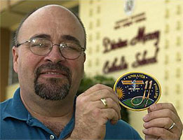
Tim Gagnon and his patch. (Photo: Malcolm Denemark, FLORIDA TODAY, April 2005)


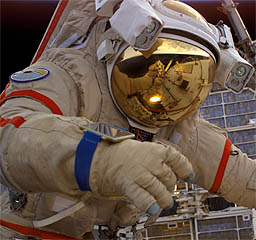
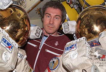
(ISS011-E-11948 - August 2005) - astronaut John L. Phillips participates during his 4 hour 58 minute EVA. (ISS011-E-11984 - August 2005) - Cosmonaut Sergei K. Krikalev poses with Russian Orlan spacesuits in the Pirs Docking Compartment.


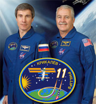
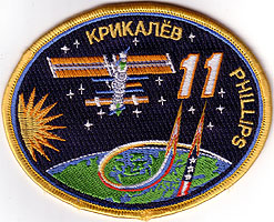
(ISS011-S-001 - February 2005) --- The emblem of the eleventh expedition to the International Space Station (ISS) emphasizes the roles of the United States and the Russian Federation in the multinational ISS partnership. The two rocket plumes, in the style of the flags of these two nations, represent the Russian Soyuz vehicles and the American Space Shuttles. The ISS image shows the configuration of the orbiting Station at the start of the expedition, with docked Soyuz and Progress vehicles and the huge American solar panels. The names of the two crew members are shown on the margin of the patch. ISS Commander Sergei Krikalev and John Phillips, NASA ISS science officer and flight engineer, are expected to launch on a Soyuz vehicle and to be in orbit during the return to flight of the Space Shuttle. The crew explains, “The beauty of our home planet and the vivid contrasts of the space environment are shown by the blue and green Earth with the Space Station orbiting overhead, and by the bright stars, dark sky, and dazzling sun.”
The crew wanted to keep the design as simple as possible so they decided that the stars would just be for aesthetic purposes and 15 are there because it looks right. No particular meaning intended.
Sergei Volkov jokingly said he is represented by the sun on the patch.


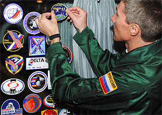
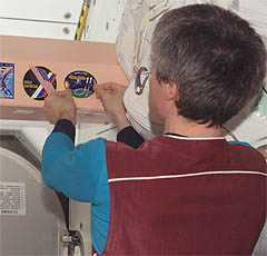
(JSC2005-E-16079 - April 2005) - Cosmonaut Sergei K. Krikalev places the crew insignia onboard the prime crew bus as they head to the Baikonur Cosmodrome for suit up. (ISS011-E-09363 - June 2005) - Cosmonaut Sergei K. Krikalev adds the Expedition 11 patch to the Unity node.

This souvenir Exp-11 patch comes from Space World in Cocoa Beach.

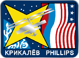
This EXP-11 design was done by Marc Jacobs. At the time he maild this design to John Philips, he was told the crew already had a design for a patch.
